
Fruit export
FOOD TRADE FROM SPAIN
Branding
Logo
Visual identity
Logo and visual identity for a wholesale fruit trading company.
A serious brand to sell fruit to the world.
Food Trade from Spain buys and sells fruit wholesale for clients looking for European produce, and what sets them apart is their customer service. We started from how they pictured it: blue and white, for crossing the sea, with the Earth and an arrow. The final logo brings together three ideas: fruit, the world and the agreement between both sides.


The logo, in positive and on their blue.
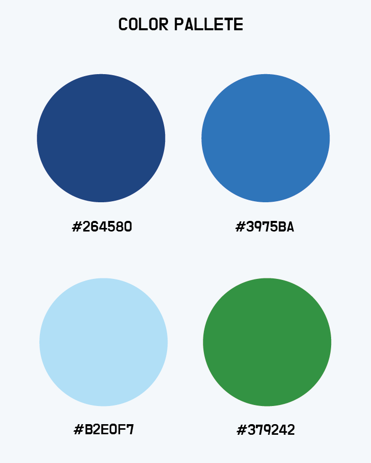


Palette, typefaces and applications.

Brand pattern.
Variations on the way to the final logo.

The concept: fruit, world and agreement.
What we did
Logo and visual identity.
_ Briefing and analysis of what shapes, colors and typefaces convey.
_ Four logo routes explored.
_ Final logo, in positive and on their corporate blue.
_ Color palette, typefaces and pattern.
What they wanted to say
Modern
Commitment
Reliability
Elegance
Sustainability
Quality

Your turn.
Tell us where you're at and we'll figure out together where to start.
Tell us about your project